Making the Psychology of Color Work for You
Kitchen
The colors that give you the most comfort in a Kitchen are colors that are warm in tone. Reds,oranges,yellows. Personally I like those colors to be more earthy in tone, from where all good comfort food comes
This range of warm colors invites you to stay, eat and enjoy. These colors are often employed in restaurants, though typically not fast food restaurants.
If you are worried that the longer you sit the more you will eat, you may want to consider how to break this rule. This is something you will have to decide. Taking time to eat (not eating more) isn't always a bad thing, it is suppose to help with digestion.
However, green tones can make the kitchen feel fresh, giving it a farm to table atmosphere. Cool Blues work well for seafood restaurants. So if you like fish, you might like the ocean feel of blues. In the end warm tones are still the top choice for use in kitchens.
*This color rule also applies to the Dining Room/rooms where you eat. There is more flexibility I feel in the range of color and how it's used in the Dining Room that extends beyond the kitchen. Richer and deeper colors like dark blue, or purple can work in the more formal Dining Room. It will also depend on rooms location to the kitchen (more in part 3).
 |
| 1.4 |
Main Living Rooms/ General Areas
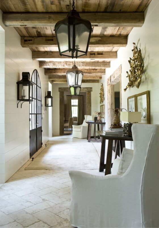
The main areas work best with neutrals, or most any color overall. The reason that I believe neutrals maintain the best for the psyche in these general areas is that they are give off the least effect, they have and even/balanced impact. This is important because more people will collectively use those rooms at any given time. Remaining neutral will likely have the best impact for everyone.
If you decide on using a distinct color in your living room, consider again the charts found in Color Theory, Part One. Even then, I would either use it in one room, but limit the overall use of many colors throughout the whole house. More on that in Part 3.
Bedrooms
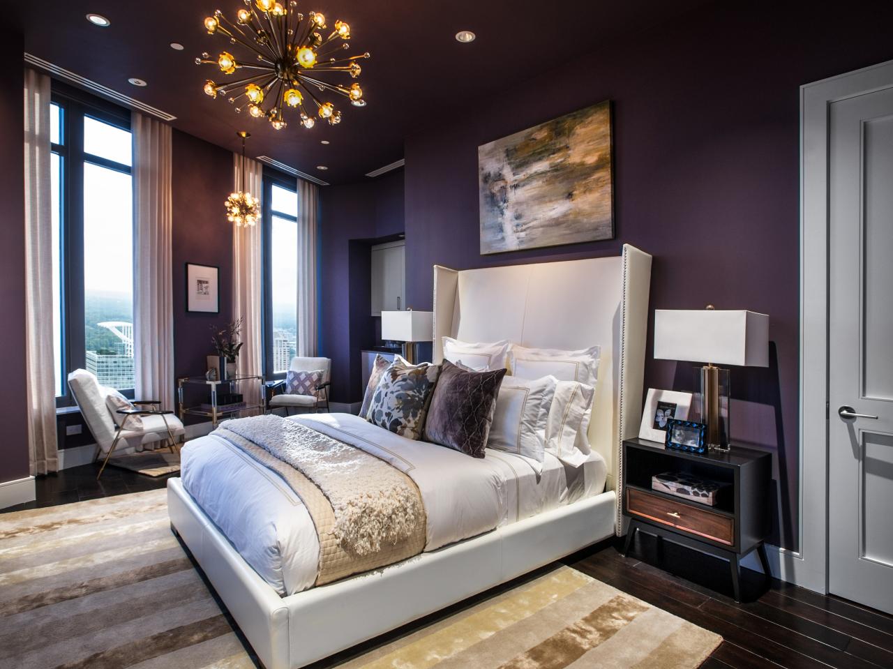
It's time to sleep. What color do you close your eyes to? The best two colors for your bedroom are blue and purple. They both create a sense of calm. It is even said that purple helps fight insomnia.
White as a neutral also has a calming effect by bringing light and purity to the room, though it may cause the room to be too reflective. This could be a problem if you have trouble sleeping. Although it might help you if you prefer to have a light on when you sleep.
Two colors you could use, but have a note of caution are green and red. Green also has a calming effect, though it also is connected to jealousy and greed. Red might insight passion, but it can also insight anger. When your aim is sleep, blue and purple are best.
 |
| 1.5 |
Bathrooms
For bathrooms I choose green, blue and white. These colors have a serene spa quality. White is particularly nice because is represents purity and cleanliness. Also, its worthy to note that light variations of colors work nicely in the bathroom because it is usually a smaller space and might not have a window, or only a small window.
 |
| 1.6 |
Den/Office
Last we have Den, or Office. Many homes now have a room designated for the home office/den because of the option to work from home. So, what is the best color to create the best work environment? Green.Green is a color that's negative includes greed. The flip side to greed is that you do need money to pay for your living expenses, and money is the color green. Yet, it is not as simple as "green is the color of money." If you go back to the list in part one you will see that green is: focus, attention, concentration, neutral, balanced, friendly, and calming.
In other words, it gets you going while keeping you calm. Work can be stressful, but doesn't have to be if your office has some good 'ol green in it.
Do you feel color, or does the color feel you?
I have given you a lot of information about the Psychology of color. These are rules you can live by, or break. How you respond to the colors you use in your home is your best guide. I hope this helps maybe answer why you have felt a certain way in a room of a certain color.
The challenge I have for you is to find one room that you are ready to tweak based on what you've learned. Go to your local hardware/paint store and pick up some paint samples based on this new information and see how they look in your room.
Stay tuned for Color Theory, Part Three. There I will show you a layering effect with colors.
'Til Next Time!
Stephanie
1.1 Photo By: S.A. McNutt, of M-N-Ms Coffeehouse Waunakee, WI
1.2 Better Homes and Gardens
1.3 Redesign House blog
1.4 StyleBlueprint
1.5 HGTV
1.6 the Creativity Exchange
1.2 Better Homes and Gardens
1.3 Redesign House blog
1.4 StyleBlueprint
1.5 HGTV
1.6 the Creativity Exchange


No comments:
Post a Comment