Tuesday, September 15, 2015

Color Theory, Part Two

1.1
Are you ready to color your world? I invite you take my color tour through you home. You will learn what colors work, and where, and why. As your reading this you might want to sit in a green room. Keep reading to find out why?

Making the Psychology of Color Work for You


Kitchen 

The colors that give you the most comfort in a Kitchen are colors that are warm in tone. Reds,oranges,yellows. Personally I like those colors to be more earthy in tone, from where all good comfort food comes 
1.2
1.3


This range of warm colors invites you to stay, eat and enjoy. These colors are often employed in restaurants, though typically not fast food restaurants. 

If you are worried that the longer you sit the more you will eat, you may want to consider how to break this rule. This is something you will have to decide. Taking time to eat (not eating more) isn't always a bad thing, it is suppose to help with digestion. 

However, green tones can make the kitchen feel fresh, giving it a farm to table atmosphere. Cool Blues work well for seafood restaurants. So if you like fish, you might like the ocean feel of blues. In the end warm tones are still the top choice for use in kitchens.

*This color rule also applies to the Dining Room/rooms where you eat. There is more flexibility I feel in the range of color and how it's used in the Dining Room that extends beyond the kitchen. Richer and deeper colors like dark blue, or purple can work in the more formal Dining Room. It will also depend on rooms location to the kitchen (more in part 3).
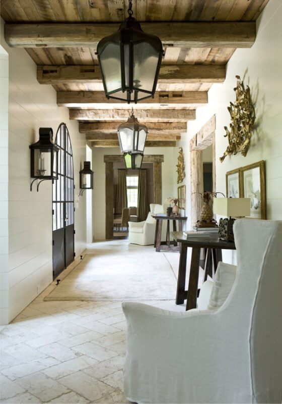

1.4

Main Living Rooms/ General Areas

The main areas work best with neutrals, or most any color overall. The reason that I believe neutrals maintain the best for the psyche in these general areas is that they are give off the least effect, they have and even/balanced impact. This is important because more people will collectively use those rooms at any given time. Remaining neutral will likely have the best impact for everyone. 

If you decide on using a distinct color in your living room, consider again the charts found in Color Theory, Part One. Even then, I would either use it in one room, but limit the overall use of many colors throughout the whole house. More on that in Part 3.
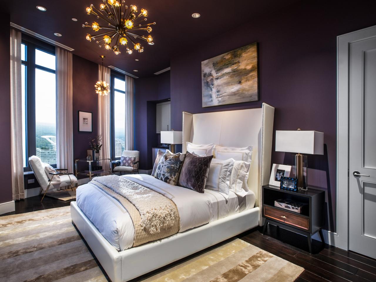

Bedrooms

It's time to sleep. What color do you close your eyes to? The best two colors for your bedroom are blue and purple. They both create a sense of calm. It is even said that purple helps fight insomnia. 

White as a neutral also has a calming effect by bringing light and purity to the room, though it may cause the room to be too reflective. This could be a problem if you have trouble sleeping. Although it might help you if you prefer to have a light on when you sleep.

Two colors you could use, but have a note of caution are green and red. Green also has a calming effect, though it also is connected to jealousy and greed. Red might insight passion, but it can also insight anger. When your aim is sleep, blue and purple are best. 
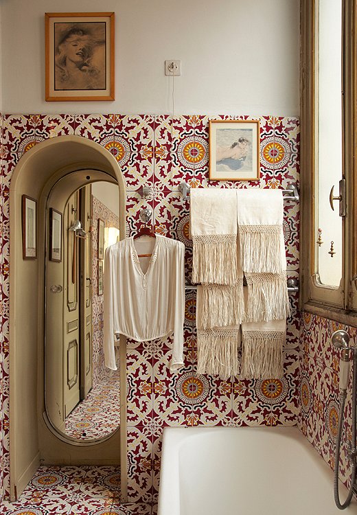
1.5

Bathrooms

For bathrooms I choose green, blue and white. These colors have a serene spa quality. White is particularly nice because is represents purity and cleanliness. Also, its worthy to note that light variations of colors work nicely in the bathroom because it is usually a smaller space and might not have a window, or only a small window.

1.6

Den/Office

Last we have Den, or Office. Many homes now have a room designated for the home office/den because of the option to work from home. So, what is the best color to create the best work environment? Green.

Green is a color that's negative includes greed. The flip side to greed is that you do need money to pay for your living expenses, and money is the color green. Yet, it is not as simple as "green is the color of money." If you go back to the list in part one you will see that green is: focus, attention, concentration, neutral, balanced, friendly, and calming. 

In other words, it gets you going while keeping you calm. Work can be stressful, but doesn't have to be if your office has some good 'ol green in it. 
Do you feel color, or does the color feel you?
I have given you a lot of information about the Psychology of color. These are rules you can live by, or break. How you respond to the colors you use in your home is your best guide. I hope this helps maybe answer why you have felt a certain way in a room of a certain color. 

The challenge I have for you is to find one room that you are ready to tweak based on what you've learned. Go to your local hardware/paint store and pick up some paint samples based on this new information and see how they look in your room. 

Stay tuned for Color Theory, Part Three. There I will show you a layering effect with colors.

'Til Next Time! 
Stephanie 


1.1 Photo By: S.A. McNutt, of M-N-Ms Coffeehouse Waunakee, WI
1.2  Better Homes and Gardens 
1.3 Redesign House blog 
1.4 StyleBlueprint 
1.5 HGTV 
1.6 the Creativity Exchange


Monday, September 7, 2015

Happy Labor Day!


HAPPY LABOR DAY from Wildflower Interior Design Blog. 
I hope you have a wonderful day with those you love. 

Stephanie


Monday, August 31, 2015

Color Theory, Part One


Welcome to Part One of my three part series on Color Theory. We will explore basic concepts of the Psychology of color for Interior Design. I will give you a color wheel refresher course. You just might feel like you are back in your Elementary Art Class, and maybe you are.

If you hang around for Part 2 and I will show you how to put the theory into practice. You might even learn how to break some rules, in the right way of course.

And finally, in Part 3 we will learn how to layer with color accents, accents like: pillows, furniture and accessories, etc...This will help give your rooms a more dimensional one, two, three punch.

Part One 

What is Color Theory?
Color theory is a theory that is based on the psychological impact of any given color on the participant viewer of said color in a given environment. It is theory that attempts to explain the emotional impact on the viewer whether the color is found in the natural environment, graphic design, consumer good, the work place, home, or media, etc...(See the above graphic for more information on the Psychology of Color).

Color theory is a complex theory because of the many nuances and influences that impact how we apply color to our environments. This is especially true due to the emotional impact, often a subtle one, on which the theory is based.

Color Basics
Before we discuss the Psychology of Color and its impact on the viewer let's go back to the beginning: the Color Wheel

Do you remember learning about Primary, Secondary an Tertiary colors? I am including a link to the Color Matter website, which discusses "Basic Color Theory". In it they go into more depth for those who would like a refresher on the more detailed aspects of the Color Wheel. For our Purpose I will include a graphic to show what the common color wheel looks like.


Primary colors are: Yellow, Red, Blue
Secondary colors are: Orange, Purple, Green
Tertiary colors are: Orange-yellow, Red-orange, Violet-red, Blue-violet, Blue-green, Yellow-green

Your Primary colors essentially make all the other colors. They are the foundation to the rest of the color wheel. However, once you move beyond the tertiary colors you will begin to get colors that vary intensity when added with their complementing colors, or if you mix colors that are on the opposite side of the color wheel you will produce a more muddy color.

Black and white are not on the color wheel because they are non-colors, rather they are light and no light. Some say white is all colors reflected in the light spectrum and black is the complete void of color with the absence of light.

Psychology of Color - Overview
The Psychology of color for the purpose of design isn't often the focus of everyday paint choices for the average consumer. If you are reading this it's because you want to go beyond being just the average consumer.

First, it is important to mention that just because there is a color theory, doesn't mean the rules apply at all times and in all cases. I want you to remember that it is based on one's own emotional response to the color. In other words, it's is ultimately based on how the color/colors make you feel. You are the determining factor in deciding what colors work for your home and office, and everyone responds to colors in different ways.

Here is a chart that shows how the color theory would typically work:

As you read over the list, do any of them surprise you? Do you agree, or disagree with this list? 

Here's how I want you to play with the ideas of Color Theory: look at the list above and the first graphic and study them. Write down your answers to the two questions previously listed. Next, ask yourself if there is any thing you would add to the list about the way you respond to color either emotionally, physically, or as a behavior. Now, pick one color that you often choose in the clothes you wear, products you buy, or paint you use. Get to know the theory of the color and make your own list about that color and how you would use it in your home. 

Next time, in part 2 of this series, I will cover how to apply this theory in your own home, or office. Now that we have a good foundation about Color Theory we can begin to personalize the theory in creating living environments that will make us truly feel at home. 

Thank you for reading Color Theory: Part 1. See you next time. 

S. McNutt


Thursday, August 27, 2015

What Inspires You?

Last year my husband and I went to Italy for the first time. As it is with most vacations the best souvenir are the photographs you take; and every time I look back at my photographs it transports me in part to the general feeling I had at that time. However, with Italy, it was the one place I've visited that create a longing to go back. Maybe it's Italy, or maybe it's me, but I am eager to return.

So, in the painting below we have Henry Holiday's depiction of Dante Alighieri meeting his Beatrice near the Ponte Vecchio Bridge in Florence, Italy. Beatrice was Dante's inspiration for his writing La Nuova Vita and La Commedia Divina. In the painting Holiday nods to the fact of her influence by putting Beatrice in the center of two other women, we will call them the three graces (muses, or sirens, depending on their purpose), whose purpose was to inspire someone (usually male) by the quality they represented (usually related to the arts).

(Dante and Beatrice, Henry Holiday 1839-1927)

The truth is, we can take inspiration anywhere: beauty can be found anywhere. So for your challenge: find a moment, place, an item, something in nature to inspire you. Contemplate why it inspires you and see where it leads when you think about incorporating it into a design for your home or office. It can be as simple as replacing pillow on a bed or sofa, or changing the paint colors of a room.

Here are a few photos that are inspired in someway by my trip to Italy:

Patterned tiles! The variations of patterned tiles in Italy are numerous yet consistent in the look and the feel, and are totally Italy! Like the tiles, the printed papers and wall murals fit right in this category. I spent most of my time in Florence looking for the perfect printed paper to bring home to my friend in Denver. And just like what is shown in this picture tiles are a great way to influence the design of your home. There are many quality tile manufacturers replicating tiles inspired by historical Italian designs. Visit your local tile professionals to explore what's out there for purchase.

If you want to think beyond tile but like these patterns, think about finding wallpaper, or hire a muralist for wall, or furniture redo.There are many ways to pull out color and design elements from the inspiration of a single tile. You could even design a floral garden with this pattern, motif and colors.
Photo credit: www.onekingslane.com

Next, this piece reminds me of the modern lines on the new Italian design, especially found in the glass work of Murano, Italy. I love the white, with the warm glow of light emanating from the center. This would work really well in a modern styled home.

Italian Designer Mamati. Image found on www.digsdigs.com.

This photo was taken on our trip to Firenze (Florence), Italy at a restaurant called Gilli. This is their candy display. What I love about it is the sheer joy of color. The way the colors complement each other and though together can be overwhelming, in small form remind me how easy it is to add bright pops of color in any room I am designing. Let people find small bits of joy in your home. You can interpret this literally by placing a glass jar full of bright little hard candies like these, or just by using the idea of these colors in your pillow fabrics, etc.


Photo credit: S.McNutt

This photo reminds me of Venice, Italy. I loved the color of the water against the buildings, which were often a great contrast of rust warm oranges. Just as this photo shows below, one way you can find inspiration is choosing a color palate for your home that invokes the colors you are drawn to and that remind you of your travels. Colors are a great way to invoke emotional responses. Later, on another post, I will cover how to follow color theory for specific rooms in your home and the emotional response those colors invoke. 

Photo credit: Mylittleloves.com

I hope this post inspires you to be inspired. I hope you are challenged to create home wherever you find yourself. Thank you for reading, and I look forward to seeing what you create. 

S. McNutt